
Canvas Legends is a program at Notre Dame where students recognize instructors for the extra work they’ve put into their Canvas course sites. While some faculty seem like “old pros” at using technology to teach, many stress that their process has simply been iterative over time; they tried something new one year, then added to it the following semester, to create what eventually became a very useful teaching tool.
Andrew Bartolini, director of the First Year Engineering program, has been designing course sites for many years. He finds that a human-centered design approach yields big results for students. Put simply, he focuses on the student experience in his courses.
“I always try to view it as what I would want in a website. I want to be able to click things and find things quickly, and not be told to go reference another page that I have to go find.”
Andrew shared some of his tactics at last April's Canvas Legends presentation.
Minimalist Navigation and Consistency are Key
Andrew builds his Canvas site organization by viewing the site from a student’s perspective.
“I don’t want to go in and get lost on a menu,” he said.
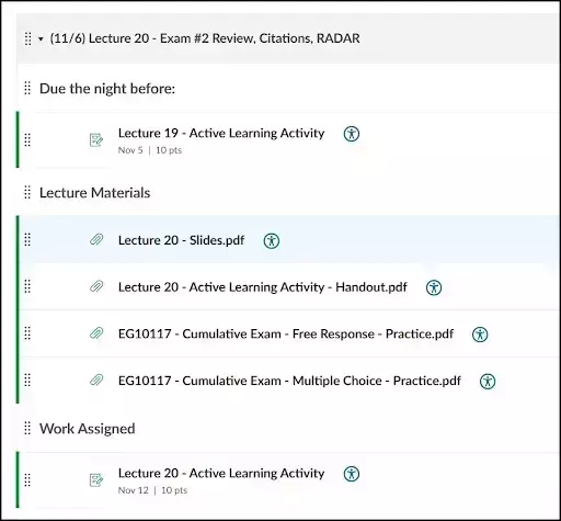
His solution is a minimalist design that prioritizes finding information quickly. The fewer clicks students need to get information and complete their assignments, the better their experience in the course.
Andrew achieves this experience with a few key strategies.
- Easy-to-Find Essentials: Critical, high-traffic information, such as drop-in hours, lab schedules, and the grade scale, is moved directly from the dense syllabus onto the home page. Andrew also now utilizes buttons over large blocks of text on his home pages, a tip he learned from another Canvas Legend. Andrew notes students won’t go back to the syllabus to find those details, so they must be immediately accessible.
- Consistency of Format: The course consists of a two-semester sequence, and the spring course page looks identical to the fall. This ensures that once students learn the organizational scheme, they never have to relearn it, building confidence and efficiency.
- Organization for Workflow: Andrew uses Modules to give students a one-stop shop for course content and learning concepts. He organizes content, assignments, and quizzes by lecture, where everything they need to do before and during class is included in one location.
- Clear Assignment Instructions: When linking assignments, the goal is to include the necessary materials directly to the assignment page. “If students click to start an assignment for homework, they don’t want to go find the homework in files, find the file, then click back into the homework,” he said. “If you just link the file in the homework, it’s like one-stop shopping. Just think about how the student would navigate the page.”
“He uses rubrics extensively, has all required information and documents linked in every assignment. He planned his course in a way where information can be found in all the places a student might look, and does EVERYTHING on Canvas (not relying on other platforms and confusing students).” —One of Andrew’s Students
Andrew sums up his approach simply:
“Students don’t come to doom scroll on Canvas. They want to get in and out very quickly.”
This focus on efficiency and clarity forms the basis of a course site that is deliberately organized to reduce cognitive load and administrative confusion for students who are “easily lost.” And his students appreciate it.