Lisa Farmer, an associate teaching professor in the Department of Biological Sciences, didn’t come to Canvas with a clear idea of how she would design her course site.
“I am not an instructional designer,” she says. “I am a scientist who transitioned into an educator mid-career.”
So over the course of several years, Lisa made it her mission to provide students with the best possible experience in Canvas, supporting their need for order and clarity. She built something that resembled a standard website where students could click on pages and easily navigate to all the materials they needed.
As a 2026 Canvas Legend—a program at Notre Dame sponsored by Teaching & Learning Technologies (TLT) where students recognize instructors for the extra work they’ve put into their course sites—Lisa presented in peer-to-peer workshops twice this year. Her enthusiasm for creating the right kind of learning environment for her students was contagious.
Watch Lisa’s Presentation for TLT’s Semester Start-Up
*Note: A Notre Dame NetID is required to watch the video.
It All Starts with a Welcome
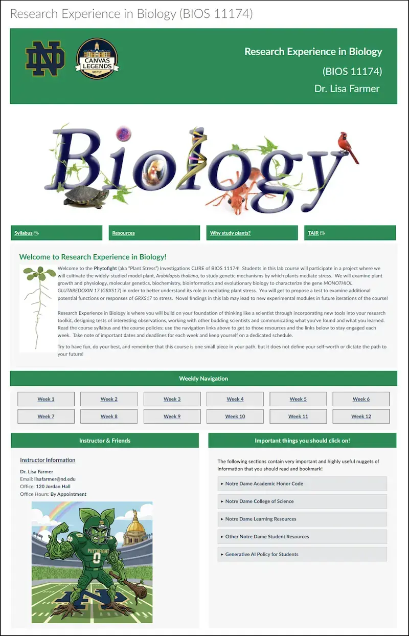
The first order of business for Lisa when preparing for a new semester is the course home page.
“I'm one of those people who really believes that a beautiful landing page catches the students’ eye and makes them want to be in Canvas,” she explains.
Early versions of the course’s home page were text-heavy, and Lisa did not feel they were inspiring or welcoming. Her redesign focused on setting the tone for the course.
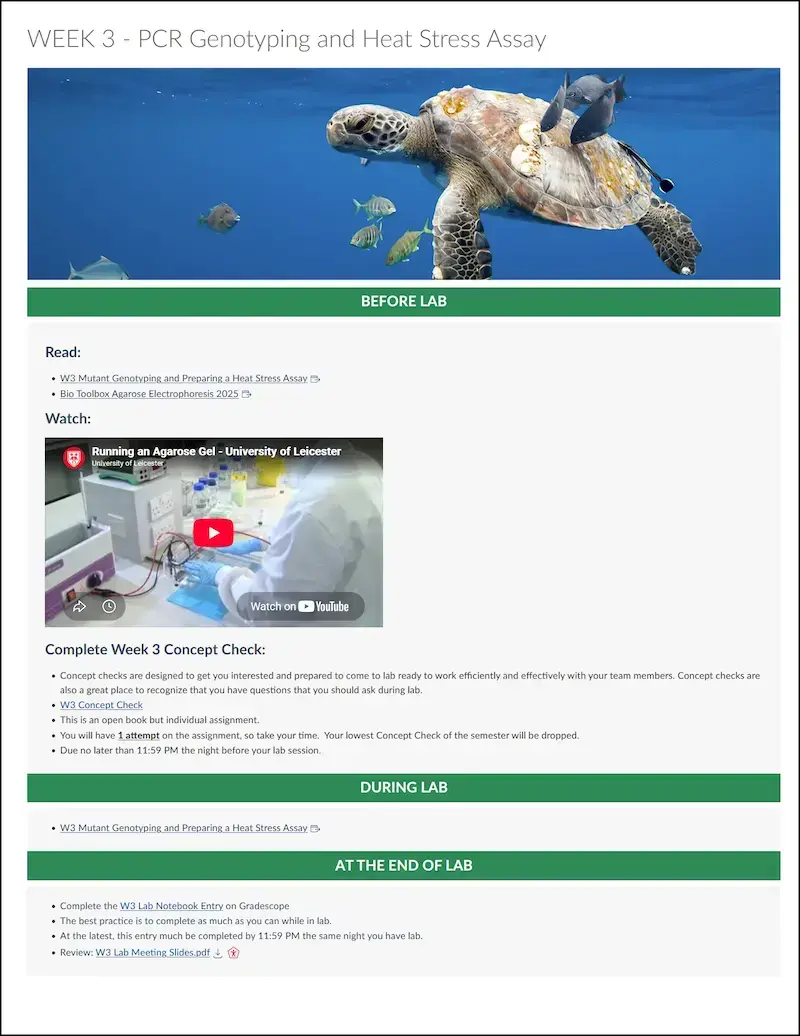
“Biology has a lot of colors and moving parts and aesthetically pleasing things, so I set out to make it easy to navigate and to wow through things like color,” Lisa says. She added a gif of a growing plant to her Canvas course card and colorful imagery throughout the weekly lab pages.
But her focus isn’t just on aesthetics. Lisa uses her home page to provide links to resources students need to access frequently, such as the syllabus, lab dates, her AI policy, and a course resource page. Surfacing these links directly on the home page gives students immediate answers to common questions, saving her from answering dozens of repetitive emails.
Building on Good Design
Lisa’s goal was to transform the standard Canvas environment into something that felt more like a traditional website.
“You never know what experience your freshmen may have with a learning management system,” she notes. “They don’t all come from schools that have used Canvas.” Creating a course that behaves like a familiar webpage provides a consistent context for every student, regardless of their prior background.
When organizing learning content, Lisa prefers not to rely heavily on modules, which some students view as an overwhelming laundry list of tasks with no clear orientation. Instead, she uses a dedicated page for each lab, presenting material in a before-during-and-after sequence that includes context alongside links to assignments, readings, and videos. This approach creates a predictable learning path from week to week, helping students know what to expect and keeping tasks digestible and meaningful.
She also releases individual lab pages just a few days before they are needed, preventing students from jumping too far ahead. This controlled release keeps everyone synchronized and breaks the work into manageable chunks.
Specifics of Her Design
Lisa likes to view the course site from her students’ perspective: How hard is it to find what’s due this week without scouring announcements or hunting through assignments and quizzes? She builds her courses around the three-click rule: students should be able to find what they need to complete—even at 11:30 at night—in three clicks or fewer.
Key takeaways from her approach include:
- Focus on visual navigation. Good web design uses buttons and descriptive labels rather than plain formatted text. While Lisa chose to learn some CSS to design her course pages, faculty can use CidiLabs for a more visually straightforward approach.
- Keep the course menu uncluttered. If you link to assignments and reference files within a page or module, hide those individual menu links from the course navigation bar so students have one clear, predictable path to content.
- Assign due dates to everything. Adding due dates ensures tasks surface automatically across Canvas views (like the Calendar and To-Do list), keeping assignments from slipping through the cracks.
Lisa notes that learning Canvas course design was a real-time process of trial and error, refined through multiple iterations based on direct student feedback. Ultimately, her thoughtful, student-centered approach is a testament to how small, intentional layout choices can transform the online learning experience to keep students engaged and on task.
Screenshots from Lisa’s Course in Canvas
Click on the following images of her course home page (left) and a sample weekly lab page to see how Lisa has put the principles she describes into practice.