Digital Accessibility |
Accessible PowerPoint Guide
- What is an Accessible PowerPoint?
- Why Accessibility Matters When Creating a PowerPoint Presentation
- How to Effectively Design an Accessible PowerPoint
- Where to Go for Help
What Is an Accessible PowerPoint?
An accessible PowerPoint is a presentation that aims to provide all users—including those with sensory, motor, and cognitive disabilities—an equal opportunity to perceive, understand, and navigate its content.
Accessible PowerPoints:
- Are readable, consistent, and easy to navigate
- Have a clear structure that screen readers can follow
- Use text, color, and visuals thoughtfully to portray information
- Include alt text for images, charts, and media
Why Accessibility Matters When Creating a PowerPoint Presentation
There are people with a varying range of abilities who might interact with your PowerPoint. It’s important to make sure your presentation is accessible in several ways to be as inclusive as possible.
Visual Disabilities
Accessible slides support people who:
- Are blind and use screen readers
- Have low vision or reduced contrast sensitivity
- Are colorblind
Why It Matters:
- Screen readers rely on proper slide structure, reading order, and alt text.
- Poor color contrast and small text can make content unreadable.
- Information conveyed by color alone may be missed entirely.
Hearing Disabilities
Accessible slides support people who:
- Are deaf or hard of hearing
- Cannot use audio in a particular environment
Why It Matters:
- Captions and transcripts make audio and video content usable.
- Slides with clear text reduce reliance on spoken explanations.
In addition, accessible PowerPoints can serve the needs of those with cognitive, learning, motor, neurological, speech, and mental health disabilities, as well as those experiencing temporary or situational limitations. Accessibility guidelines aim to help you create PowerPoint content that is clear, usable, and accessible to everyone.
How to Effectively Design an Accessible PowerPoint
Tips for Slide Structure
- Use a built-in slide layout and avoid adding text boxes manually.
- Give each slide a distinct title.
- Limit the amount of information per slide.
- Use a maximum of six lines of text per slide and six words per line to maintain clarity.
- Instead of adding extra text boxes, use the standard layouts (accessed under Home > Layout).
- Avoid using color as the only way to convey meaning. Support color-coded data with secondary elements like descriptive text or unique icons so the information remains accessible without color.
-
Validate your slide’s reading order (accessed under Review > Check Accessibility > Reading Order Pane) to create a logical flow for screen-reader users. Simply tab through the elements on each slide to confirm they are selected in the correct narrative sequence and adjust positions, if needed.
- Microsoft offers a helpful explainer video on creating slides with an accessible reading order.
- When linking to something, use descriptive text that portrays what’s in the hyperlink rather than generic phrases like “Click here.”
Tips for Text Formatting
- Use a contrast checker to help make text readable by providing a high color contrast between it and the background.
- Choose easy-to-read fonts and use appropriate font sizes.
- Minimum size: 18 pt
- Larger font sizes for headings and subheadings
Tips for Images and Graphics
Alternative text, or alt text, describes the content of an image. You should provide alt text for all important visuals while marking non-essential visuals as “decorative.”
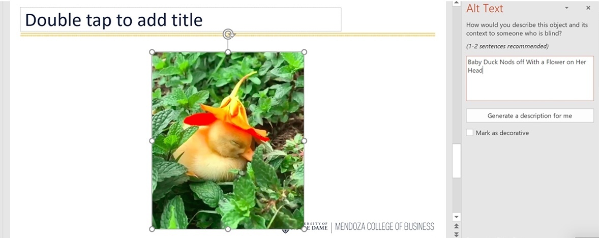
- To add alt text to an image in PowerPoint, you can either (a) right-click the image and select Edit Alt Text or (b) Click on the image and select Picture Format > Alt Text.
- Once you have accessed the Alt Text window as described in the previous bullet, type in a description of the image and its context to someone who cannot see it (Figure 1).
-
- Important: If the image or shape does not serve any learning purpose, mark it as decorative.
Accessibility Checkers
Accessibility checkers can be helpful tools for reviewing your presentation.
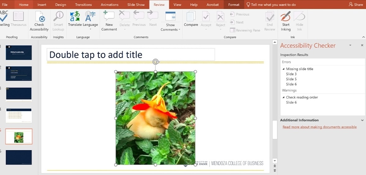
- The maker of PowerPoint, Microsoft provides this how-to guide for its built-in accessibility checker. The checker itself is accessed in PowerPoint via Review > Check Accessibility. On the right side of your screen, it will let you know which slides are missing titles, if there are images needing alt text, whether content can be read in order, and more (Figure 2).
- WebAIM also offers a detailed resource article on PowerPoint accessibility.
- You can check that the meaning of your visuals isn’t changed due to the various forms of color blindness by using the Color Blindness Simulator.
Where to Go for Help
If you have questions about how to integrate digital accessibility into your course materials, please contact the Office of Digital Learning (online@nd.edu).